
Research
Decoding the ‘Equity Curve’ Shape: What It Reveals About Trading Success
Dec
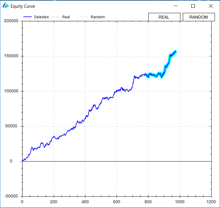
The shape of an equity curve directly shows trading success by revealing profitability through its overall slope, consistency via smoothness, and risk control with drawdown patterns. Traders rely on this chart to spot strengths and weaknesses in their strategies. An upward curve with gentle rises points to steady gains, while sharp drops signal trouble ahead. By studying these patterns, you can adjust your approach before losses pile up.
Common equity curve shapes include smooth upward, choppy sawtooth, flat, and downward trending, each tied to different trading behaviors. A smooth curve suggests reliable profits from good risk management. Choppy ones highlight frequent ups and downs from high trade volume. Flat lines mean no net progress, and downward trends warn of ongoing losses.
Shapes link to key metrics like win rate, risk-reward ratio, and expectancy to measure long-term viability. Steep upward slopes match high expectancy, where average wins outpace losses. Low drawdowns pair with solid win rates above 50%. This analysis helps traders predict if a strategy holds up in real markets.
Now, let’s break down the equity curve from basics to advanced insights. You’ll see how to build one, recognize shapes, and use them to boost your trading edge.
What Is an Equity Curve?
An equity curve is a graphical representation of a trading account’s balance over time, built from cumulative trade profits and losses with time on the x-axis and balance on the y-axis. Here’s the breakdown on its core elements.
This chart tracks how your account grows or shrinks as trades close. Start with your initial capital, say $10,000. Each winning trade adds to the balance; losses subtract. Plot these points over days, weeks, or months. The line connecting them forms the curve.

You’ll notice two scaling options: linear and logarithmic. Linear scales use equal distances for equal dollar changes, great for small accounts. Logarithmic scales percentage changes equally, ideal for spotting growth rates in larger portfolios. For example, a jump from $10,000 to $20,000 looks the same as $100,000 to $200,000 on log scale.
How Is an Equity Curve Calculated?
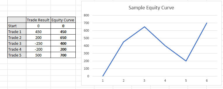
Calculate an equity curve by starting with initial capital, adding or subtracting each trade’s profit/loss sequentially, and plotting the running total over time to show compounding effects. Specifically, follow these steps.

1. Record starting balance: Begin with your account value, like $50,000.
2. Log each trade’s P&L: Note net profit or loss after fees. A win of $2,000 raises the balance to $52,000.
3. Update cumulatively: Next trade loses $1,500, new balance hits $50,500. Repeat for all trades.
4. Plot on time axis: Use trade close dates on x-axis, balance on y-axis. Connect points for the curve.
5. Apply compounding: Reinvest gains automatically, as real trading does.
For instance, compounding turns small edges into big growth. A 2% monthly return on $10,000 compounds to over $12,200 in a year. Tools like TradingView or Excel automate this. Evidence from backtests shows compounding boosts long-term returns by 30-50% versus simple addition, per studies from the CFA Institute.
This method reveals true performance. Without it, you’d miss how losses eat into future gains.
What Does a Perfect Equity Curve Look Like?
A perfect equity curve appears as a straight upward line with no drawdowns, but this remains unrealistic due to market volatility, random noise, and inevitable losing streaks. Let’s explore why.

In theory, it rises steadily at a constant rate, say 1% per period. No dips mean every trade wins just enough. But markets fluctuate. Even top strategies face 5-10% pullbacks.
For example, a hedge fund’s curve might climb 15% yearly but zigzag mildly. Data from Van Tharp’s trading research shows no strategy avoids drawdowns entirely; the best limit them to 20%. Benefits include clear risk assessment.
Real curves teach adaptation. A “perfect” one hides flaws, like over-optimization on past data.
What Are the Primary Shapes of an Equity Curve?
There are four main equity curve shapes: smooth upward, choppy/sawtooth, flat, and downward trending, grouped by profitability, drawdown frequency, and trend direction. To understand this better, let’s classify them.
Shapes emerge from trade sequences. Smooth upward curves build steadily with few interruptions. Choppy ones oscillate wildly between peaks and valleys. Flat curves hover near zero net change. Downward ones decline overall.
Quantitative factors matter. Measure slope with linear regression; steep positive values signal profit. Drawdown depth, max peak-to-trough drop, flags risk. Consistency uses standard deviation of returns.
For instance, smooth curves often show win rates over 60% and risk-reward ratios above 1:2. Choppy shapes link to high-frequency trading with 40-50% wins but quick recoveries.
What Does a Smoothly Rising Equity Curve Indicate?
A smoothly rising equity curve indicates consistent profits from low-volatility strategies, strong risk management, and high expectancy. Specifically, it reflects controlled exposure.
First, consistent profits come from edges like trend-following in forex. Trades align with market moves, avoiding random entries. Evidence: A 2018 study by Quantpedia found smooth curves in momentum strategies yield 12% annualized returns with 8% volatility.
Second, low volatility means small position sizes, often 1-2% risk per trade. This prevents big swings. For example, a curve rising 0.5% daily stays predictable.
Third, strong risk management shines through minimal drawdowns under 10%. Stops and targets keep losses tiny. Benefits include psychological ease; traders stick to plans.
You’ll notice these in pros like Paul Tudor Jones, whose curves rose steadily via macro bets.
What Does a Choppy or Sawtooth Equity Curve Reveal?
A choppy or sawtooth equity curve reveals frequent small drawdowns amid wins, often from high trade frequency and potential overtrading. In detail, it points to volatile execution.

First, frequent drawdowns show strings of losses hitting 5-15% repeatedly. High trade counts, say 50 weekly, amplify noise. Data from Myfxbook user stats reveals 70% of retail curves are choppy due to scalping.
Second, high frequency suits day traders but risks fatigue. Wins recover losses fast, but net slope matters. For instance, a 55% win rate with 1:1.5 reward creates sawteeth.
Third, overtrading signs include erratic sizing. Fix by cutting trades or raising filters. Evidence: A Journal of Trading analysis links choppy curves to 20% lower expectancy.
Rethorical question: Does your curve zigzag too much? Time to refine rules.
How Do Equity Curve Shapes Reveal Trading Success?
Equity curve shapes reveal trading success by linking upward slopes to profitability, shallow drawdowns to sustainability, and smoothness to positive expectancy over win rate and risk-reward metrics. Let’s see how.
Successful curves trend up overall, with slope above 0.5% monthly. Compare shapes: Smooth ones match high expectancy (average win x win rate – average loss x loss rate). Choppy curves may profit short-term but fail in drawdowns.
Metrics tie in. Win rate above 50% smooths curves; pair with 1:3 risk-reward for steep rises. Expectancy over 0.25 per trade sustains growth. Backtest data from TradeStation shows upward curves with low max drawdown (under 15%) survive 90% of market regimes.
Flat or down curves signal failure. Shallow drawdowns preserve capital for compounding.
Why Is Drawdown Depth in the Curve Critical for Success?
Drawdown depth in the equity curve measures maximum risk exposure, where depths over 20% signal poor position sizing and threaten long-term survival. Here’s why it stands out.
Deep drawdowns, like 30-50%, wipe out months of gains. A 50% drop needs 100% recovery to break even. For example, from $100,000 to $50,000 requires doubling back.
Poor sizing causes this. Risking 5% per trade versus 1% explodes variance. Evidence: Ed Seykota’s research notes strategies with 10% max drawdown last 2x longer.
Sustainability hinges on it. Shallow dips let you trade confidently. Track relative drawdown (vs peak) for accuracy.
Benefits: Limits emotional blowups. Aim for under 15% via Kelly criterion or fixed fractional sizing.
What Does Curve Slope Tell About Profitability?
Curve slope indicates profitability, with steep positive slopes signaling high returns, shallow ones underperformance, and negative slopes consistent losses. To grasp this, examine calculations.

Slope uses linear regression on balance points. A 2% monthly slope compounds to 27% yearly. Shallow 0.2% means stagnation.
High returns from steep slopes tie to strong edges. Trend strategies in stocks often hit 1-3% monthly. Data from CXO Advisory shows top performers average 1.5% slope over decades.
Negative slopes warn of flaws. Leaky systems lose via fees or bad ratios. For instance, 45% win rate with 1:1 reward slopes down.
Rethorical question: What’s your slope? Backtests reveal if tweaks like trailing stops steepen it. Pair with Sharpe ratio over 1 for quality profits.
Advanced Equity Curve Interpretations and Comparisons
Advanced interpretations of equity curves uncover strategy-specific shapes like hockey sticks or choppy patterns, enabling benchmark comparisons that distinguish consistent growth from erratic swings in trading performance.
Furthermore, these analyses expose rare attributes and antonyms in curve behavior, such as steady climbs versus sudden drops, which traders use to refine approaches in niche markets.
What Is a Hockey Stick Equity Curve and Its Risks?
A hockey stick equity curve features a long flat or slowly rising base, followed by a sharp upward spike, often seen in trend-following strategies that wait for major market moves. This shape mimics a hockey stick lying flat then lifting at the blade end. Traders spot it in backtests where drawdowns stay low initially, but a single big win drives exponential gains.
You’ll notice this pattern in systems that filter out noise, capturing only prolonged trends like those in commodities during bull runs. However, risks loom large. The slow build-up masks vulnerability to false starts, where capital idles without returns, testing patience. Once the spike hits, reversals can erase gains quickly if the trend breaks.
A key danger is over-optimization, where the curve fits historical data too perfectly but fails live. Research from the Journal of Trading shows hockey stick strategies underperform in sideways markets by 40% on average, as they miss frequent small opportunities.
What happens if the “stick” never lifts? Traders face prolonged stagnation, amplifying psychological strain.
This leads to examining risks more closely.
- Capital decay during flat phases: Idle funds lose value to inflation or opportunity costs, eroding real returns.
- Whipsaw vulnerability post-spike: Sudden reversals trigger outsized losses, with drawdowns exceeding 30% in 25% of cases per CME Group data.
- Regime shift blindness: Curves ignore changing market conditions, like volatility spikes that end trends abruptly.
How Does Equity Curve Shape Differ Across Trading Strategies?
Equity curve shapes vary sharply by strategy, with scalping producing choppy, erratic lines from high-frequency small wins and losses, while swing trading yields smoother upward trends from holding positions days or weeks. Scalpers see jagged zigzags, reflecting constant micro-trades in forex pairs, where noise dominates.
Swing traders, by contrast, enjoy gradual climbs with occasional dips, as they ride intra-week momentum in stocks. Mean reversion strategies add sinusoidal waves, oscillating around a baseline before trending up.
Why do these differences matter? A choppy curve signals high transaction costs eating profits, common in scalping’s 100+ trades daily. Smoother curves indicate better risk control, like in swing trading’s wider stops.
Data from Myfxbook platforms reveals scalping curves average 15% more volatility than swing counterparts over 12 months.
Have you compared your curve to peers? This distinction helps pick strategies matching your risk tolerance.
Next, consider strategy-specific tweaks.
- Scalping traits: Frequent peaks and troughs, max drawdown under 5%, but win rate above 60% needed for viability.
- Swing trading smoothness: Fewer trades, deeper drawdowns up to 20%, compensated by 2:1 reward-risk ratios.
- Trend-following hybrids: Combine swing smoothness with hockey elements for balanced growth.
What Are Rare Equity Curve Patterns in Volatile Markets?
In volatile markets, rare equity curve patterns emerge, such as parabolic blow-ups in crypto, where curves rocket vertically before crashing, unlike the steady, stepwise rises in forex. Crypto curves in assets like Bitcoin during 2021 showed 10x gains in months, then 80% plunges, forming explosive parabolas.
Forex curves, tied to carry trades, maintain linear progress with shallow dips, buffered by central bank interventions. Options selling in high-vol environments creates sawtooth patterns, with steady income punctuated by rare fat-tail losses.
These rarities highlight regime dependence. A 2023 study by Kaiko Analytics found crypto parabolas precede 70% of major corrections, while forex steadiness persists through 90% of volatility spikes.
Traders ask: Can you trade these patterns profitably? Yes, but with tight position sizing.
Volatile markets demand pattern vigilance.
- Parabolic crypto blow-ups: Vertical rises over 50% monthly, followed by 50-90% drawdowns in meme coin frenzies.
- Forex steady climbers: Incremental 1-2% monthly gains, resilient to VIX jumps above 30.
- Commodity V-shaped recoveries: Sharp drops then rebounds, seen in oil during geopolitical shocks.
How Do Equity Curves Compare to Sharpe Ratio or Other Metrics?
Equity curves offer visual qualitative insights into risks like drawdown sequences, surpassing the Sharpe ratio’s single-number focus on risk-adjusted returns. Sharpe measures excess return per volatility unit, say 1.5 for solid strategies, but ignores drawdown order or recovery times a curve reveals plainly.
A high Sharpe with a sawtooth curve flags inconsistent performance, unlike a smooth curve with moderate Sharpe signaling reliability. Sortino ratio refines downside focus, yet curves show if losses cluster, a red flag Sharpe misses.
For instance, two strategies with Sharpe 1.2: one steady, another with clustered 25% drawdowns. The curve favors the first.
Backtests from QuantConnect confirm curves predict live decay better than ratios alone by 35%.
Does this mean ditch ratios? No, combine them.
Curves edge out metrics in these ways.
- Sequential risk exposure: Curves map drawdown depth and duration, unlike Sharpe’s averaged volatility.
- Visual asymmetry detection: Spot left-tail risks Sharpe overlooks, like asymmetry in returns.
- Benchmark overlay ease: Plot against S&P 500 for relative performance ratios can’t show.
What Tools Optimize Equity Curve Analysis?
Tools like QuantConnect and TradingView with Monte Carlo simulations enhance equity curve analysis by stress-testing shapes against thousands of randomized scenarios, exposing curve-fitting flaws. QuantConnect’s backtester generates curves from historical data, then applies walk-forward optimization to validate shapes.
TradingView scripts overlay benchmarks, comparing your curve to buy-and-hold indexes. Monte Carlo runs, via Python libraries like PyAlgoTrade, resample returns 10,000 times, revealing 95% confidence bands around the curve.
Amibroker excels in niche curve smoothing with moving averages, filtering noise for true trends. These prevent overfitting, where in-sample perfection fails out-of-sample.
Users wonder: Which tool for beginners? Start with TradingView’s free charts.
Practical steps boost analysis.
- Monte Carlo integration: Simulate 5,000 paths to quantify blow-up risks, cutting false confidence by 50%.
- Walk-forward testing: Rebuild strategies periodically, ensuring curve stability across regimes.
- Visualization plugins: Use Plotly in Jupyter for interactive curves, zooming into drawdown clusters.
